To make a website using html and css, you need to write the code using html for the structure and css for the design. First, create an html file and write the necessary elements such as header, footer, and navigation.
Then, add the css styling to customize the appearance of the elements. Using css, you can change fonts, colors, backgrounds, and layout. By combining html and css, you can create a visually appealing and interactive website. With html handling the structure and css handling the design, you have full control to create a unique and professional website.
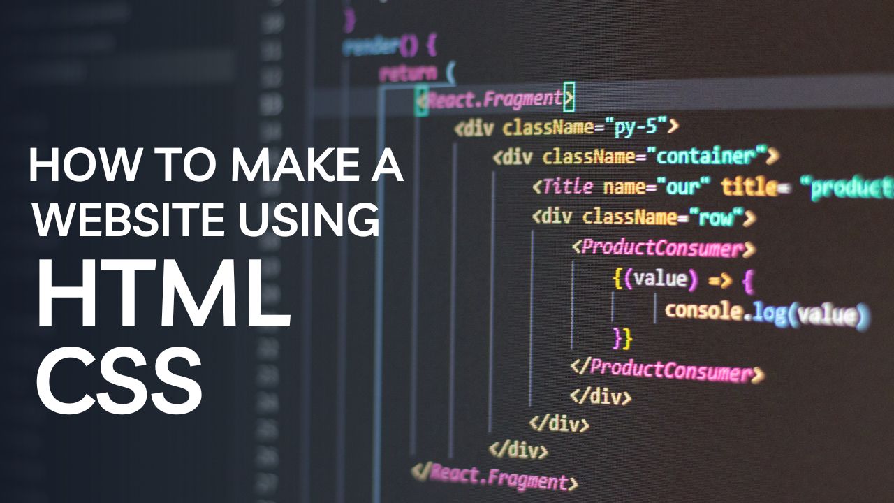
The Role Of HTML And CSS In Website Development
HTML And CSS: An Introduction
When it comes to creating a website, having a basic understanding of html and css is essential. Html, short for hypertext markup language, is the backbone of any webpage. It provides the structure and framework of the content, allowing browsers to interpret and display the information properly.
On the other hand, CSS, which stands for cascading style sheets, is responsible for the design and presentation of the website. It controls how the elements of the webpage look, including the layout, colors, fonts, and spacing.
Plain paragraph: html and css work hand in hand to build and style websites. Let’s take a closer look at the individual roles of these two fundamental languages in website development:
- Html:
- HTML is the markup language used to structure the content on a webpage.
- It utilizes tags to identify and define the elements of a web page, such as headings, paragraphs, links, images, and tables.
- By using these tags correctly, developers can create a well-organized and semantically meaningful structure for a website.
- HTML provides accessibility features, allowing screen readers and assistive technologies to interpret web content for users with disabilities.
- Css:
- CSS is responsible for the visual appearance of a website, including layout, colors, fonts, and spacing.
- It separates the presentation from the structure of the webpage, allowing developers to easily modify the design without altering the underlying html code.
- Css selectors target specific html elements, defining their appearance through rules and declarations.
- With css, designers can create visually appealing websites that are consistent across different web browsers and devices.
By combining html and css, developers can bring life to their website designs. Html provides the structure, while css adds the aesthetics and visual appeal. Mastering these languages is crucial for anyone interested in building their own website or pursuing a career in web development.
So, now that we have a general understanding of html and css, let’s dive deeper into each language and explore their key features, syntax, and how they work together to create stunning websites.
Setting Up Your Development Environment
Before you start creating your website using html and css, it’s important to set up your development environment. This involves choosing a text editor and creating a project folder. Let’s go through each step in detail:
Choosing A Text Editor:
- A text editor is a software used to write and edit code. It’s important to choose one that suits your needs and preferences. Here are some popular options you can consider:
- Visual studio code: This is a free and feature-rich text editor with a wide range of extensions and great community support.
- Sublime text: Known for its speed and simplicity, sublime text offers a smooth coding experience with customizable features.
- Atom: Developed by github, atom is highly customizable and has a user-friendly interface that makes coding enjoyable.
- Consider the following factors when choosing a text editor:
- Ease of use: Look for an intuitive interface and user-friendly features.
- Customization: Find a text editor that allows you to customize the editor’s appearance and functionality according to your preferences.
- Extensions and plugins: Look for a text editor that supports a wide range of extensions and plugins to enhance your coding experience.
Creating The Project Folder:
- Creating a project folder is essential for organizing your website files. Here’s how you can do it:
- Choose a location: Decide where you want to store your project folder on your computer. It could be your desktop or any other convenient location.
- Create a new folder: Right-click on the chosen location and select “new folder.” Give it a name that reflects your project, such as “mywebsite.”
- Organize your files: Inside the project folder, create additional folders to organize different types of files. For example, you can create separate folders for html, css, javascript, and images.
- Save your files: As you create and edit your website files, save them directly into the respective folders within your project folder.
- Organizing your project files in a well-structured folder will make it easier for you to locate and manage your files throughout the development process.
Setting up your development environment correctly will create a solid foundation for building your website using html and css. Choose a text editor that suits your requirements and preferences, and create a project folder to organize your files effectively. Now that you have everything in place, you’re ready to start coding your website!
Creating The Structure Of Your Website
Now that you’re ready to dive into building your own website, let’s start by creating the structure using html and css. This step is crucial as it sets the foundation for your entire website. In this section, we’ll cover the important steps to create the structure effectively.
Creating The Html File
To begin, you’ll need to create a new html file that will serve as the backbone of your website. Follow these steps:
- Open a text editor, such as notepad or sublime text, and create a new file.
- Save the file with a .html extension to ensure it is recognized as an html file.
Adding Doctype Declaration
Next, you’ll want to add a doctype declaration at the beginning of your html file. This declaration informs the browser about the version of html you are using.
Building The Html Skeleton
With the html structure in place, you’ve taken an important step towards creating your own website. In the next section, we’ll explore adding css to style and enhance the visual appeal of your website. So, let’s move on to the next step and bring your website to life with css!
Styling Your Website With Css
After you have created the structure of your website using html, it’s time to add some style to it! Css (cascading style sheets) is the language used to make your website visually appealing and engaging. Let’s dive into some key aspects of styling your website using css.
Linking Your Css File To Html:
To begin styling your website, you need to link your css file to your html document. Here’s how you can do it:
- Replace “style.css” with the path to your css file if it’s located in a different directory.
- Save your html document and css file.
- Your html file is now connected to your css file, and you can start adding styles to your webpage.
Selectors And Properties:
Css uses selectors to target specific elements on your webpage and applies properties to style those elements. Here are some commonly used selectors and properties:
- Selector: Element selector
- Explanation: Selects all elements of a specific type.
- Example: `p` targets all paragraphs on the webpage.
- Selector: Class selector
- Explanation: Selects elements with a specific class attribute.
- Example: `.highlight` targets all elements with the class “highlight”.
- Selector: Id selector
- Explanation: Selects a unique element with a specific id attribute.
- Example: `#logo` targets the element with the id “logo”.
- Property: Color
- Explanation: Sets the text color of an element.
- Example: `color: blue;` makes the text color blue.
- Property: Background-color
- Explanation: Sets the background color of an element.
- Example: `background-color: yellow;` sets the background color to yellow.
Styling Text And Fonts:
Css provides various properties to style the text and fonts on your website. Here are some examples:
- Property: Font-family
- Explanation: Defines the font family for text.
- Example: `font-family: arial, sans-serif;` sets the font to arial.
- Property: Font-size
- Explanation: Sets the size of the text.
- Example: `font-size: 16px;` sets the font size to 16 pixels.
- Property: Text-decoration
- Explanation: Adds visual effects to text, such as underline or strike-through.
- Example: `text-decoration: underline;` underlines the text.
Working With Colors And Backgrounds:
Css allows you to add colors and backgrounds to your website elements. Here are some ways to utilize colors and backgrounds effectively:
- Property: Background-image
- Explanation: Sets an image as a background for an element.
- Example: `background-image: url(“background.jpg”);` sets the background image.
- Property: Background-color
- Explanation: Sets the background color of an element.
- Example: `background-color: #f2f2f2;` sets the background color to a light gray shade.
- Property: Opacity
- Explanation: Adjusts the transparency of an element.
- Example: `opacity: 0.5;` sets the element to be 50% transparent.
By understanding and implementing css, you can transform the appearance of your website and create a visually captivating experience for your visitors. Explore different selectors, properties, and styles to make your website unique and enjoyable to navigate. Happy styling!
Adding Images And Multimedia
In today’s digital world, a website without visually appealing elements falls flat. Adding images and multimedia can greatly enhance the user experience and make your website more engaging. Let’s explore how you can effectively incorporate these elements into your website using html and css.
Inserting Images
Images can convey messages, set the tone, and capture the attention of your website visitors. Below are the steps to insert images into your website:
- Create a folder in your project directory to store all the images you intend to use.
- Use the `
` tag to insert an image into your web page. Here’s the basic syntax:
- The `src` attribute specifies the path to your image file.
- The `alt` attribute provides an alternative description for the image, which is useful for accessibility purposes.
- Make sure to provide a descriptive and concise `alt` text that accurately represents the image, even if it’s purely decorative. This ensures that visually impaired users and search engines can understand the context of the image.
Optimizing Images For The Web
To ensure that your website loads quickly and efficiently, it’s crucial to optimize your images for the web. Follow these best practices:
- Compress your images: Reduce the file size of your images without compromising quality. There are online tools and software available that can help you achieve this.
- Use the appropriate file format: Choose the right file format for your images. Jpeg is great for photographs, while png is ideal for images with transparency.
- Resize your images: Scale your images to the desired dimensions before including them in your web pages. Avoid using html or css to resize large images, as it can slow down page loading times.
- Lazy loading: Implement lazy-loading techniques to load images only when they are in the user’s viewport. This improves page loading speed, particularly for websites with numerous images.
Incorporating Videos And Audio Files
Videos and audio files can make your website more interactive and engaging. Here’s how you can incorporate them:
Remember to consider the accessibility aspect while adding multimedia elements. Provide captions, transcripts, or alternative formats for users who may have difficulty accessing audio or visual content.
Adding images, videos, and audio files to your website creates a visually appealing and immersive experience for your visitors. By following these guidelines, you can ensure that your website is both visually stunning and fast-loading. So, go ahead and unleash your creativity to make your website truly captivating!
Building A Responsive Design
When it comes to creating a website, it’s crucial to ensure that it looks good and functions well on all devices. With the increase in mobile usage, having a responsive design has become more important than ever. In this section, we will explore css media queries and how they can help you make your website mobile-friendly.
CSS Media Queries
Css media queries allow you to apply different styles to your website based on different device attributes such as screen size, orientation, and resolution. By using media queries, you can create a responsive design that adapts seamlessly to various devices, whether it’s a desktop computer, a tablet, or a smartphone.
Here are a few key points to consider when using css media queries:
- Breakpoints: Media queries are typically defined using breakpoints, which are specific screen widths at which your styling changes. By using breakpoints, you can customize the layout and design of your website for different devices.
- Syntax: Media queries can be added directly to your css code using the `@media` rule. Within the media query block, you can specify the conditions under which the styles should be applied. For example, `@media screen and (max-width: 768px) { … }` would target screens with a maximum width of 768 pixels.
- Mobile-first approach: It’s generally recommended to adopt a mobile-first approach when using media queries. This involves designing the mobile version of your website first and then progressively adding styles for larger screens. This approach ensures that your website is optimized for mobile devices from the start.
- Flexibility: Media queries offer great flexibility in adjusting the layout and content of your website based on the device being used. You can hide or show certain elements, resize images, and reposition content to enhance user experience on different screen sizes.
Making Your Website Mobile-Friendly
In addition to using css media queries, there are several other important factors to consider when making your website mobile-friendly. Here are some essential steps you should take:
- Responsive images: Optimize your images for different screen sizes by using techniques such as responsive images and image compression. This will ensure that your website loads quickly on mobile devices without sacrificing quality.
- Touch-friendly navigation: Consider implementing touch-friendly navigation elements like hamburger menus or swipe gestures. These make it easier for mobile users to navigate your website with their fingertips.
- Readability: Ensure that your text is legible on smaller screens. Use appropriate font sizes, line spacing, and contrast to enhance readability. Avoid long blocks of text and break them up into smaller paragraphs or bullet points.
- Page speed: Mobile users often have slower internet connections, so it’s essential to optimize your website’s performance. Minimize file sizes, leverage browser caching, and reduce the number of server requests to improve page loading speed.
- User testing: Finally, don’t forget to test your website on different devices and screen sizes. This will allow you to identify any issues or areas for improvement, ensuring a smooth user experience across all platforms.
By implementing css media queries and following these mobile-friendly practices, you can create a website that looks great and functions seamlessly on all devices. Embracing responsive design is not only necessary for providing an optimal user experience but also for improving your website’s visibility and rankings in search engine results.
So, take the time to optimize your website for mobile and reap the benefits of a well-designed, mobile-responsive site.
Adding Interactivity With Javascript
Javascript is a powerful programming language that can bring interactivity and dynamic features to your website. By incorporating javascript into your html code, you can create interactive elements that respond to user actions and enhance the user experience. In this section, we will explore the basics of javascript and how you can add interactivity to your website.
Introduction To Javascript
Javascript is a client-side scripting language that allows you to add functionality to your website. It is widely used for creating interactive web pages, handling form validation, creating animations, and much more. Here are a few key points to know about javascript:
- Javascript is a programming language that runs on the client’s browser, meaning it is executed on the user’s device rather than on the server.
- It is often referred to as the “language of the web” as it is supported by all major web browsers, making it a versatile choice for web development.
- Javascript allows you to manipulate html elements, change their appearance, content, and behavior, hence making your website more interactive and engaging.
Incorporating JavaScript Into Html
- External javascript file: For larger projects or when using javascript across multiple web pages, it is recommended to create an external javascript file with a .js extension. This file can then be linked to your html document using the `` tag, placed within the head or body section.
Creating Interactive Elements
Javascript enables you to create interactive elements on your website, enhancing user engagement and interactivity. Here are a few ways you can utilize javascript to create interactive elements:
- Event handling: Javascript allows you to define event listeners that respond to user interactions, such as clicks, mouse movements, and keyboard inputs. These event listeners can trigger javascript functions to perform specific actions.
- Dom manipulation: Javascript provides powerful methods to manipulate the document object model (dom). You can use javascript to dynamically update the content of your web page, change styles, add or remove html elements, and more.
- Form validation: Javascript can be used to validate user input in forms, ensuring that the data entered by the user is in the correct format and meets specific criteria. This can help enhance the user experience and prevent errors.
- Animation and effects: With javascript, you can create animations and visual effects to make your website more dynamic and visually appealing. You can animate elements, create slide shows, implement scrolling effects, and more.
Javascript is a versatile language that enables you to add interactivity to your website. By incorporating javascript into your html code, you can create interactive elements, handle user interactions, and enhance the user experience. With its wide range of capabilities, javascript is an essential skill for web developers seeking to create engaging and dynamic websites.
So, why not take advantage of javascript and make your website come alive with interactivity?
Testing And Debugging Your Website
Creating a website using html and css is an exciting journey, but it’s important to thoroughly test and debug your website to ensure it functions seamlessly and looks great across different browsers. In this section, we’ll explore two crucial aspects: validating html and css, and achieving cross-browser compatibility.
Validating Html And Css:
Ensuring that your html and css code is error-free is essential for a well-functioning website. Use the following methods to validate your code:
- Online validators: There are several online tools available that allow you to validate your html and css code effortlessly. Simply copy and paste your code into these validators to identify any errors or warnings.
- W3c markup validation service: This powerful tool provided by the world wide web consortium (w3c) helps you validate your html code. It highlights any errors, making it easier for you to correct them and ensure compliance with web standards.
- Css validation service: Similar to the w3c markup validation service, the css validation service helps you validate your css code. It detects errors in your styling, helping you maintain consistency and compatibility across browsers.
Validating your code not only helps you identify any mistakes or missing elements, but it also improves your website’s overall performance and makes it more accessible to users.
Cross-Browser Compatibility:
Different web browsers may interpret html and css code differently, which can lead to inconsistencies in the appearance and functionality of your website. To achieve comprehensive cross-browser compatibility, consider the following steps:
- Test on multiple browsers: Make sure to test your website on popular browsers such as google chrome, mozilla firefox, safari, and microsoft edge. This will help you identify any issues specific to certain browsers and make the necessary adjustments.
- Responsive design: Ensure that your website is responsive and adapts well to different screen sizes and resolutions. This will ensure optimal user experience across various devices and browsers.
- Css vendor prefixes: Some css properties may require vendor prefixes to work correctly on certain browsers. Research and implement the appropriate prefixes to make sure your website appears consistent across all browsers.
- Compatibility testing tools: Utilize browser compatibility testing tools like browserstack or crossbrowsertesting to identify any compatibility issues and troubleshoot them quickly.
Achieving cross-browser compatibility is crucial for delivering a stellar user experience and expanding your website’s reach to a wider audience.
By validating your html and css code and ensuring cross-browser compatibility, you can create a website that is both visually appealing and functionally robust. These steps will help you identify and fix any issues, resulting in a smooth and seamless user experience across multiple browsers.
Happy testing and debugging!
Launching Your Website
Congratulations on creating your website using html and css! It’s an exciting step towards establishing your online presence. Now, it’s time to launch your website and make it accessible to the world. In this section, we will explore hosting options, domain and web hosting setup, ensuring that your website is ready to go live.
Hosting Options
When it comes to hosting your website, you have several options to choose from. Each option offers different features and pricing plans, so it’s essential to understand them before making a decision. Here are some popular hosting options:
- Shared hosting: With shared hosting, your website will be hosted on a server shared with other websites. It’s an affordable option for small to medium-sized websites.
- Virtual private server (vps) hosting: Vps hosting provides dedicated resources on a virtual private server. It offers greater control and scalability compared to shared hosting.
- Dedicated server hosting: In dedicated server hosting, your website gets an entire server to itself, resulting in optimal performance and customization options.
- Cloud hosting: Cloud hosting utilizes multiple servers to host your website, providing maximum uptime and scalability.
Domain And Web Hosting Setup
Before launching your website, you need to set up your domain and web hosting. Here’s how:
- Choose a domain: Select a unique and memorable domain name that reflects your website’s purpose. Consider using relevant keywords to improve search engine optimization (seo).
- Register your domain: Find a reputable domain registrar and register your chosen domain. Ensure that the registration is in your name or your organization’s name for full ownership.
- Select a web hosting provider: Research and choose a reliable web hosting provider based on your website’s requirements and budget. Consider the provider’s uptime guarantee, customer support, and server location.
- Purchase a hosting plan: Select an appropriate hosting plan from your chosen provider. Start with a plan that meets your current needs and allows for future growth.
- Configure dns settings: After purchasing hosting, update your domain’s dns settings to point to your web host’s server. This step ensures that visitors can reach your website using your domain name.
- Set up email accounts: If needed, create professional email accounts using your domain name. This adds credibility to your website and enables effective communication with visitors.
- Upload your website files: Using ftp (file transfer protocol) or a file manager provided by your web hosting control panel, upload your website files to the server.
- Test your website: Before the official launch, thoroughly test your website for functionality and compatibility across different devices and web browsers.
- Secure your website: Implement security measures such as ssl certificates to protect sensitive data and enhance user trust.
- Go live: Once you are satisfied with the testing results, update any necessary settings and make your website live for the world to see.
Launching your website is an exciting milestone. With the right hosting option and a well-executed domain and web hosting setup, your website is ready to make a strong impression online.
Further Improvements And Optimization
Making a website using html and css is a great accomplishment, but there are always ways to enhance its performance and optimize it for search engines. In this section, we will explore some key techniques for improving your website’s performance and implementing seo best practices.
Let’s delve into it:
Performance Optimization Techniques:
- Minify your html and css files: Minification involves removing unnecessary characters, such as white spaces and line breaks, from your code. By doing so, you can reduce the file size, leading to faster loading times for your website.
- Compress your images: Large image files can significantly slow down your website. To improve performance, make sure to compress your images without compromising on quality. You can utilize tools like adobe photoshop or online services to achieve this.
- Enable browser caching: By enabling browser caching, you instruct the visitor’s browser to store certain files, such as images and scripts, locally. This results in faster load times for return visitors since the browser doesn’t need to download the same files again.
- Optimize your javascript: Javascript can impact the performance of your website. Consider concatenating and minifying your javascript files to reduce http requests and boost loading times.
- Use a content delivery network (cdn): A cdn helps distribute your website’s files across various servers worldwide, improving loading speeds for visitors located far from your server’s location.
Seo Best Practices:
- Optimize your meta tags: Ensure each page on your website has unique and descriptive meta tags, including a compelling title tag and concise meta description. These elements are vital for search engine optimization.
- Create search engine-friendly urls: Make sure your urls are readable and contain relevant keywords. Avoid using generic or meaningless parameters in your urls.
- Add alt text to your images: Adding descriptive alt text to your images provides search engines with valuable information and increases the accessibility of your website for visually impaired visitors.
- Implement structured data: Utilize schema markup to enhance search engine understanding of your website’s content. This will enable search engines to display rich snippets, which can enhance your website’s visibility in search results.
- Build quality backlinks: Acquiring high-quality backlinks from reputable websites helps establish the credibility and authority of your website. Focus on acquiring natural backlinks through content creation, guest posting, and relationship-building within your industry.
By implementing these performance optimization techniques and adhering to seo best practices, you can ensure your website is not only visually appealing but also highly functional, fast-loading, and search engine-friendly. Take the time to optimize your website, and you’ll reap the rewards with improved user experience and better search engine rankings.
Frequently Asked Questions Of How To Make A Website Using Html And CSS
How Do I Create A Website Using Html And CSS?
Creating a website using html and css involves writing the code for the structure and design of the web pages. Html is used for creating the content and structure, while css is used for styling and layout. By combining these two languages, you can create a functional and visually appealing website.
What Are The Essential Html And Css Tags For Website Creation?
Are There Any Resources Or Tutorials Available For Learning Html And CSS?
Absolutely! There are plenty of resources and tutorials available online to learn html and css. Websites like w3schools, mozilla developer network (mdn), and freecodecamp offer comprehensive guides and interactive exercises for beginners. Additionally, youtube channels and online courses can also provide step-by-step instructions for learning html and css.
Conclusion
Mastering html and css empowers you to create professional websites that captivate audiences and drive online success. By understanding the fundamental structure and styling elements of these coding languages, you can unleash your creativity and bring your design visions to life.
Incorporating a user-friendly interface with responsive design ensures that your website is accessible and functional across a variety of devices, leading to enhanced user experiences. Remember to optimize your code and content for search engines, utilizing appropriate keywords and meta tags to improve your site’s visibility and attract organic traffic.
Regularly updating and maintaining your website will ensure it remains relevant and engaging for visitors. By following the techniques and best practices outlined in this guide, you have acquired the necessary skills to build stunning websites that effectively communicate your brand’s message.
Start coding with confidence today and watch your online presence thrive.